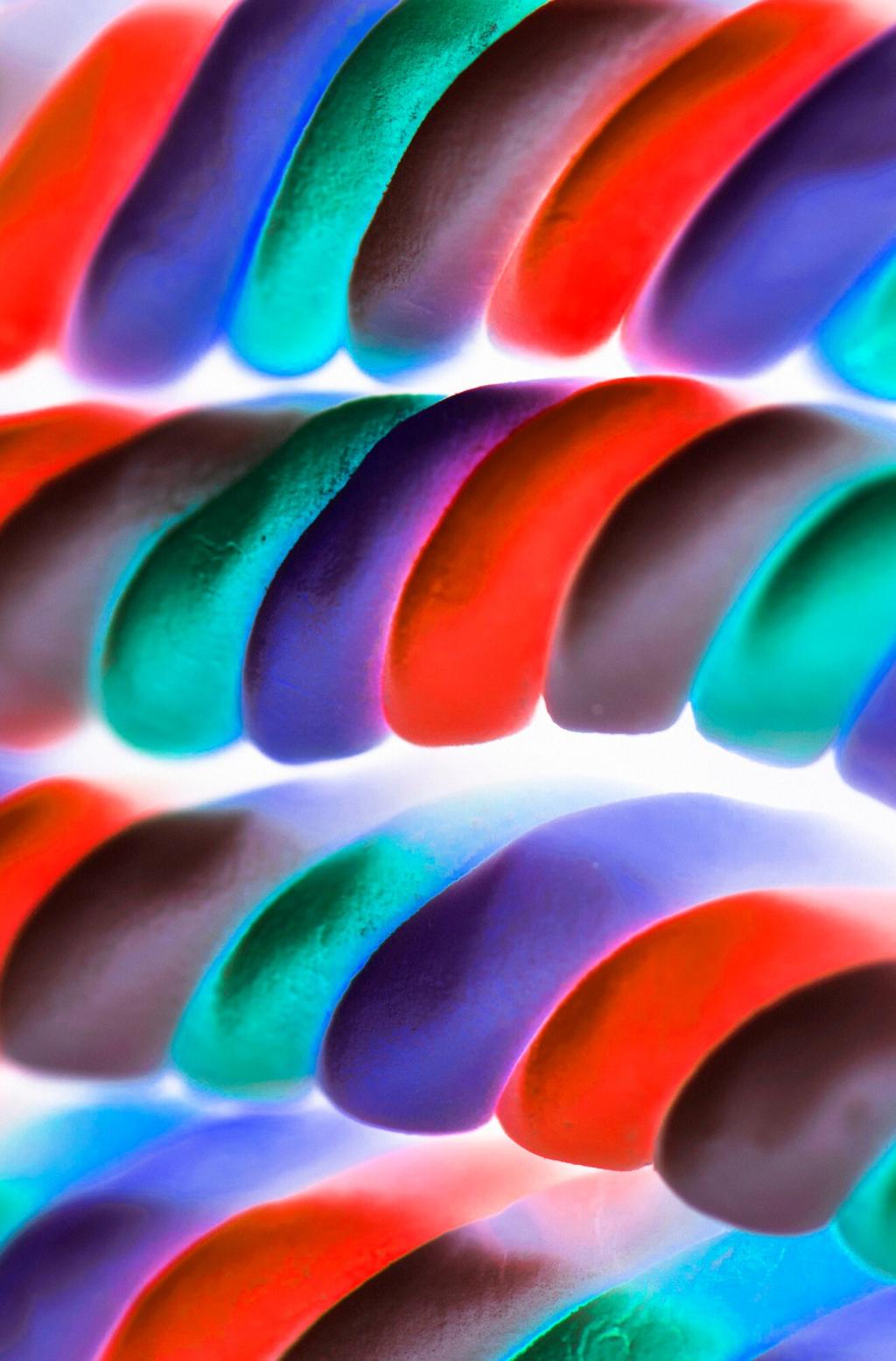
Choosing the Right Color for a Productive Environment

Chosen theme: Choosing the Right Color for a Productive Environment. Color isn’t just decoration—it can steer mood, sharpen focus, and change how work feels, hour by hour. Today we’ll translate color psychology into practical moves you can make at home or in the office. Share your color experiments in the comments and subscribe for fresh, research-backed tips each week.

Color Psychology at Work

Why Blue Calms and Clarifies

Blue is linked to trust and cognitive control, making it ideal for complex problem-solving, data analysis, and strategic planning. A soft, desaturated blue can reduce visual noise, slow your breathing, and lower perceived stress. Try a muted blue accent wall or desk mat, and tell us if your focus stretches longer before fatigue sets in.

Green for Sustained Focus

Green echoes nature, signaling safety and restoration. Studies show even brief exposure to green can improve sustained attention and reduce eye strain during screen-heavy work. Consider sage or olive tones, plants within your peripheral vision, or a green fabric pinboard. Do you notice fewer headaches or smoother transitions between tasks when green enters your workspace?

Red: Use Like a Highlighter

Red commands attention, amplifying urgency and detail orientation. It can sharpen proofreading and quality checks, but too much may elevate stress. Use red sparingly: a timer, binder spine, or small shelf can cue focus without overwhelming the room. When a deadline looms, do targeted red accents help you lock in and finish strong?

Lighting + Color: The Productivity Duo

Where daylight is abundant, soft greens and earthy neutrals flourish without glare. Position your desk to avoid direct beams on screens, and let green accents live near windows to keep the view soothing. As your circadian rhythm benefits from daylight, notice if your patience and reading stamina rise with the subtle presence of green.

Spaces that Work: Home Office, Studio, and Team Rooms

In compact spaces, gentle colors stretch perceived room size and reduce visual clutter. Try sage shelves, a dusty blue backdrop for video calls, or warm greige walls to soften shadows. I swapped a busy collage for a muted blue pinboard and saw fewer mid-call distractions. Which single change could make your room feel steadier?

Color Experiments You Can Try This Week

Week 1: blue accessories for clarity. Week 2: green for endurance. Week 3: red highlights for urgency windows. Keep everything else constant and journal focus, mood, and mistakes. At the end, tally which color supported your most valuable metrics. Ready to share your winner and what surprised you along the way?

Color Experiments You Can Try This Week

Switch your OS accent color to blue or green and test dark vs light modes during different tasks. Many people find dark mode helpful for late reading, but light mode aids editing accuracy. Reduce blue light only after sunset. Screenshot your settings, track comprehension and typos, and tell us what configuration pulled ahead.

Cultural and Personal Nuance

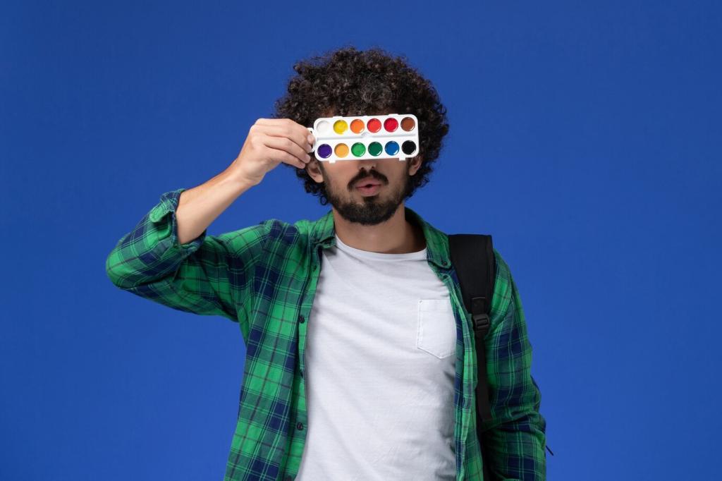
Red can signal luck and celebration in East Asia, danger in Western contexts, or hospitality in other regions. White reads clean and modern to some, mourning to others. Yellow evokes joy and visibility but can fatigue if too bright. When aligning offices across regions, test palettes locally and invite feedback before rolling out widely.

Cultural and Personal Nuance

For some neurodivergent folks, saturated colors and busy patterns trigger fatigue or overwhelm. Muted palettes, clear organization, and gentle contrasts support comfort and concentration. A colleague with sensory sensitivity found solace in cool greige walls and one soft green shelf. What accommodations help your brain feel steady and safe to do its best work?

From Palette to Action: A Simple Decision Framework

01
Map your week: deep research blocks, creative sprints, meetings, admin. Choose colors that support your energy curve—cooler for morning clarity, warmer for late-day decompression. If your calendar swings wildly, use portable color accents to shift modes on demand. What does your rhythm say your space should whisper to you?
02
Start with a low-distraction base—soft white, warm gray, or pale greige. Layer one clarity color (blue or green) and one activation color (subtle red or coral). Sample paints on multiple walls and view them morning, noon, and night. Photograph and compare. Which combination helps you breathe deeper and think straighter?
03
Track focus minutes, revision counts, and how you feel at closing time. Keep the 80/20: amplify colors that fuel most of your best work, minimize the rest. A small startup we know iterated palettes quarterly, then locked in sage plus slate once bug rates dropped. What metrics will tell you the palette is paying off?
Hexateknologi
Privacy Overview

This website uses cookies so that we can provide you with the best user experience possible. Cookie information is stored in your browser and performs functions such as recognising you when you return to our website and helping our team to understand which sections of the website you find most interesting and useful.